ShopDreamUp AI ArtDreamUp

Deviation Actions


Description
TADA~
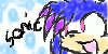
 This is my first SA Attempt, of your FC (which I maded for yous) Louise the Cheetah!
I ACTUALLY LOVE THIS APART FROM THE FACT THE HIGHLIGHTS ARE TOO FAT BUT WHO FUCKING CARES I MEAN LOOK AT IT ;_;
First attempt = YES.
critiques are acceptable, but not compulsory. (Smile)")
This is my first SA Attempt, of your FC (which I maded for yous) Louise the Cheetah!I ACTUALLY LOVE THIS APART FROM THE FACT THE HIGHLIGHTS ARE TOO FAT BUT WHO FUCKING CARES I MEAN LOOK AT IT ;_;
First attempt = YES.
critiques are acceptable, but not compulsory.
Image size
1077x1704px 854.84 KB
© 2011 - 2024 wednesdaysofdoom
Comments70
Join the community to add your comment. Already a deviant? Log In
I guess I can go a for critique |D.
Lets start with anatomy. Her fingers on her right hand are too long. The longest finger is the middle finger and they shouldn't be the same size. The crouch area looks odd. It looks to bulgy. It need to be more straight so it doesn't like a boner or some <img src="e.deviantart.net/emoticons/s/s…" width="15" height="15" alt="
The coloring looks fine except when you do SA style, the outline part of the character needs to be smooth looking. I can see that you used the pressure on the outlined part. THATS A NO NO! Keep the lines the same when you are linarting in SA style <img src="e.deviantart.net/emoticons/s/s…" width="15" height="15" alt="
I know its your first time at this but keep practicing <img src="e.deviantart.net/emoticons/s/s…" width="15" height="15" alt="